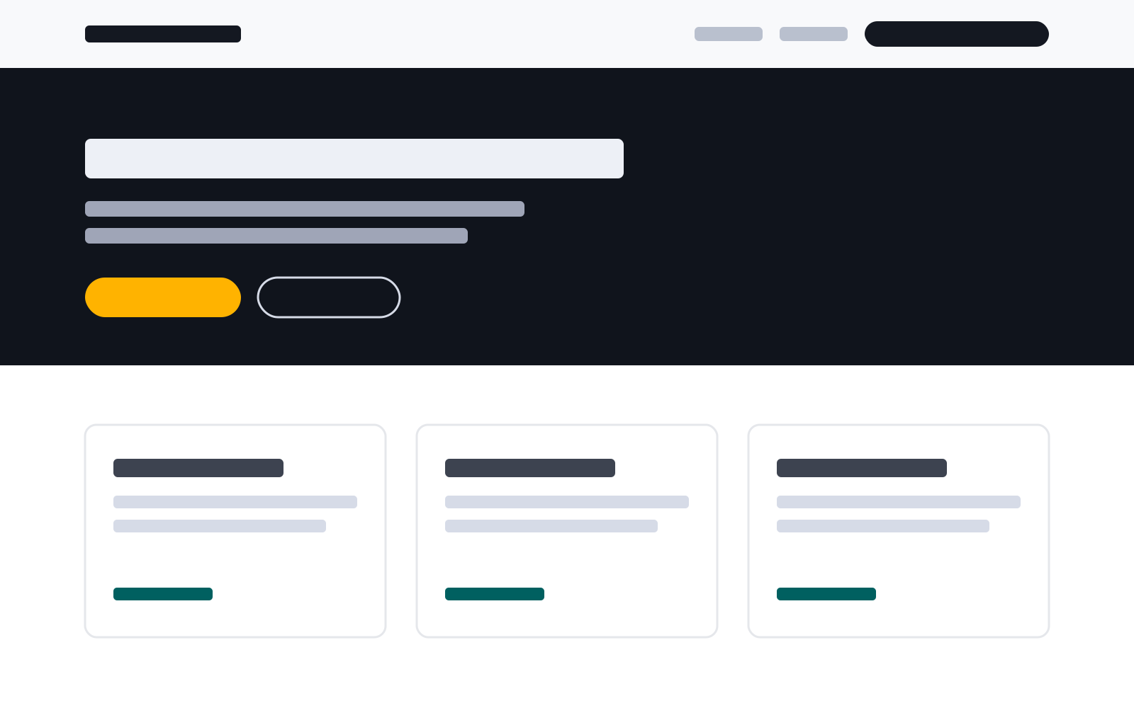
A stylesheet that styles HTML elements by what they are and where they sit. Write semantic markup and link the sheet, and the page gets the FivePaths layout, a light and a dark scheme, and text that clears WCAG AAA contrast.
Pin the release. A release is published once and never changes, so the sheet you reviewed is the sheet visitors receive. The current release is 3.6.1; base.css with no number follows the newest.
The first element in the body is the skip link. It stays off screen until it has focus.
The header is a brand link and then a nav. aria-current marks the page you are on, and class="ink" marks the header's one call to action.
Only a direct child of a section is placed in the content column. A div wrapped round a section's content takes it out of the grid.
The footer's first paragraph is the byline row, and its small is the fine print.
The site's own sheet
A site's own rules go in site.css, linked after the framework. The framework's rules sit in cascade layers and a site sheet does not, so a site rule wins without extra specificity. A name the site invents carries the site's prefix.
site.css
/* What this site has and the framework does not */[data-example-map] {
aspect-ratio: 4 / 3;
border: 1px solid var(--fp-rule);
border-radius: var(--fp-radius);
}
Structure
Sections and bands
A section is a band across the page, and data-band picks its ground.
Markupmain > section > header
<header>
  <p>Structure</p>
  <h2>Sections and bands</h2>
  <p>A section is a band across the page, and <code>data-band</code> picks its ground.</p>
</header>
A p before the heading is an eyebrow, and the p after it is the lead. Give an eyebrow only to the few sections that need one.
Band values
data-band
Ground
none
The page ground.
alt
The alternate ground, for every other section.
dark
The near-black ground. Everything inside re-reads its tokens and adapts.
hero
The opening band, dark, carrying the page's h1.
proof
One line of claim beside a chip, dark.
cta
The closing band, dark and centred.
strip
A thin band between two rules.
data-tight on any band gives it less vertical padding.
Wider than the column
data-width="wide" takes the wider track. "full" runs to the viewport edges and drops the frame.Markup: Wider than the columnmain > section > [data-width="wide"]
<figuredata-width="wide">
<imgsrc="example-screen.svg"alt="A page laid out in the framework: a header, a dark hero, and three cards"width="1600"height="1000">
<figcaption><code>data-width="wide"</code> takes the wider track. <code>"full"</code> runs to the viewport edges and drops the frame.</figcaption>
</figure>
Lists and groups
A list in main is styled by being one. data-list picks a shape that needs a grid.
A list
Each item gets a drawn dot, so nothing falls back to a missing glyph.
Running text is capped at a readable measure.
Markup: A listmain ul:not([data-list])
<ul>
  <li>Each item gets a drawn dot, so nothing falls back to a missing glyph.</li>
  <li>Running text is capped at a readable measure.</li>
</ul>
A list of checks
Both colour schemes
A 44px target on every control
Markup: A list of checksmain ul[data-marker="check"]
<uldata-marker="check">
<li>Both colour schemes</li>
<li>A 44px target on every control</li>
</ul>
A numbered list
Link the release.
Write the markup.
Check both schemes.
Markup: A numbered listmain ol:not([data-list])
<ol>
  <li>Link the release.</li>
  <li>Write the markup.</li>
  <li>Check both schemes.</li>
</ol>
Steps
Pin a release
The sheet you reviewed is the sheet you serve.
Write elements
Their position carries the layout.
Run the checks
Contrast, targets and reflow, in both schemes.
Markup: Stepsol[data-list="steps"]
<oldata-list="steps">
<li><h3>Pin a release</h3><p>The sheet you reviewed is the sheet you serve.</p></li>
<li><h3>Write elements</h3><p>Their position carries the layout.</p></li>
<li><h3>Run the checks</h3><p>Contrast, targets and reflow, in both schemes.</p></li>
</ol>
Its content sits in a div and gets the same padding.
Three across
data-cols sets the count once there is room for it.
Markup: Cardsul[data-list="cards"]
<uldata-list="cards"data-cols="3">
<li><ahref="#tokens">
<h3>A card that links</h3>
<p>The link fills the card, so the whole card is the target.</p>
<span>See the tokens</span>
</a></li>
<li><div>
<h3>A card that does not</h3>
<p>Its content sits in a div and gets the same padding.</p>
</div></li>
<li><div>
<h3>Three across</h3>
<p><code>data-cols</code> sets the count once there is room for it.</p>
</div></li>
</ul>
<divdata-actions>
<ahref="#start">Set up a page</a>
<ahref="base.css">Read base.css</a>
</div>
The first link is the primary action and takes the fill; the rest are secondary. A second primary needs a second group. ghost, ink and teal name a variant where position cannot.
Layouts and blocks
A two-column layout is named in data-layout. A figure is framed by what it holds.
Split panels
One option
Each child is a panel.
The other
data-band="dark" on a panel re-points its tokens, so it reads correctly with no rules of its own.
Markup: Split panels[data-layout="split"]
<divdata-layout="split">
<div>
<h3>One option</h3>
<p>Each child is a panel.</p>
</div>
<divdata-band="dark">
<h3>The other</h3>
<p><code>data-band="dark"</code> on a panel re-points its tokens, so it reads correctly with no rules of its own.</p>
</div>
</div>
Feature rows
Copy on one side
Two columns that stack below 56rem. flip swaps them, uneven weights them, and top aligns them to the top.
Markup: Feature rows[data-layout~="feature"]
<divdata-layout="feature">
<div>
<h3>Copy on one side</h3>
<p>Two columns that stack below 56rem. <code>flip</code> swaps them, <code>uneven</code> weights them, and <code>top</code> aligns them to the top.</p>
</div>
<figure>
<imgsrc="example-screen.svg"alt="A page laid out in the framework: a header, a dark hero, and three cards"width="1600"height="1000">
</figure>
</div>
A table
Release files
File
Changes
base-3.6.1.css
Never
base.css
With each release
tokens.json
With each release
Markup: A tablefigure:has(> table)
<figuretabindex="0"aria-label="Release files">
<table>
<caption>Release files</caption>
<thead><tr><thscope="col">File</th><thscope="col">Changes</th></tr></thead>
<tbody>
<tr><thscope="row">base-3.6.1.css</th><td>Never</td></tr>
<tr><thscope="row">base.css</th><td>With each release</td></tr>
<tr><thscope="row">tokens.json</th><td>With each release</td></tr>
</tbody>
</table>
</figure>
A table scrolls sideways inside its figure, so the figure takes tabindex="0" and a label to be reachable from the keyboard.
A quotation
This sheet is for generated markup, where the component set is closed and a checker fails a build whose structure does not match.
base.css, header commentMarkup: A quotationfigure:has(> blockquote)
<figure>
  <blockquote><p>This sheet is for generated markup, where the component set is closed and a checker fails a build whose structure does not match.</p></blockquote>
  <figcaption>base.css, header comment</figcaption>
</figure>
The figcaption is the title bar. The classes c, k, m and p on its spans come from a highlighter, for comments, keys, attributes and values.
A definition list
Band
The ground a section sits on.
Measure
The cap on a line of running text, in ch.
Markup: A definition listdl
<dl>
  <dt>Band</dt>
  <dd>The ground a section sits on.</dd>
  <dt>Measure</dt>
  <dd>The cap on a line of running text, in <code>ch</code>.</dd>
</dl>
Callouts
Markup: Calloutsaside[data-severity]
<aside>
<p>Note</p>
<p>The first paragraph is the label, so the severity is written as well as coloured.</p>
</aside>
<asidedata-severity="warning">
<p>Warning</p>
<p>A published release is never revised. Cut a new one and move the pin.</p>
</aside>
<asidedata-severity="critical">
<p>Important</p>
<p>Every colour is a token. A colour written as a literal misses the dark scheme and the dark bands.</p>
</aside>
A disclosure
What the triangle shows
It points right while the panel is closed and down once it is open.
Markup: A disclosuredetails > summary
<details>
  <summary>What the triangle shows</summary>
  <p>It points right while the panel is closed and down once it is open.</p>
</details>
Links
A link in a sentence, like this one to the tokens, keeps the height of its line; data-target marks a link that stands alone.
<p>A link in a sentence, like this one to <ahref="#tokens">the tokens</a>, keeps the height of its line; <code>data-target</code> marks a link that stands alone.</p>
<p><adata-targethref="tokens.json">tokens.json</a> <spanaria-hidden="true">·</span> <adata-targethref="base.css">base.css</a></p>
A link marked with data-target gets a 44px target. The sheet also gives one to a link that is the only element in its paragraph, list item or definition, which is why the first paragraph here holds a code as well.
Chips, blips and fine print
v3BlueGreenRedOrangePurple
Fine print is a small element, in the muted ink.
Markup: Chips, blips and fine print[data-chip], [data-route], small
<p>
<spandata-chip>v3</span>
<spandata-route="blue">Blue</span>
<spandata-route="green">Green</span>
<spandata-route="red">Red</span>
<spandata-route="orange">Orange</span>
<spandata-route="purple">Purple</span>
</p>
<small>Fine print is a small element, in the muted ink.</small>
A route blip is the one place colour carries meaning, for data such as a transit line. It is never chrome.
Forms
A form that names its layout gets styled labels, fields and choices. A form without data-layout is left as the browser draws it.
A column of fields
Markup: A column of fieldsform[data-layout="stack"]
<formdata-layout="stack"action="#forms">
<div><labelfor="s-name">Name</label><inputid="s-name"name="name"autocomplete="name"></div>
<div><labelfor="s-email">Email</label><smallid="s-email-hint">Only used to reply.</small><inputid="s-email"type="email"name="email"autocomplete="email"aria-describedby="s-email-hint"></div>
<div><labelfor="s-topic">About</label>
<selectid="s-topic"name="topic"><option>A correction</option><option>The data</option><option>Something else</option></select></div>
<div><labelfor="s-message">Message</label><textareaid="s-message"name="message"></textarea></div>
<fieldset>
<legend>Reply by</legend>
<label><inputtype="radio"name="reply"value="email"checked> Email</label>
<label><inputtype="radio"name="reply"value="phone"> Phone</label>
</fieldset>
<label><inputtype="checkbox"name="copy"> Send me a copy</label>
<divdata-actions><buttontype="submit">Send</button><buttontype="reset">Clear</button></div>
</form>
A field is a div holding its label, a hint in small if it has one, and then its control. A fieldset groups radios or checkboxes, and each choice sits inside its label, which is the 44px target. A reset button is the secondary one.
Filters
Markup: Filtersform[data-layout="filters"]
<formdata-layout="filters"action="#forms"role="search"aria-label="Filter records">
<div><labelfor="f-kind">Kind of item</label>
<selectid="f-kind"name="kind"><optionvalue="">Any</option><option>Ordinance</option><option>Resolution</option><option>Agreement</option></select></div>
<div><labelfor="f-from">From</label><inputid="f-from"type="date"name="from"></div>
<div><labelfor="f-q">Words in the title or the report</label><smallid="f-q-hint">Every word must appear.</small><inputid="f-q"type="search"name="q"aria-describedby="f-q-hint"></div>
<divdata-actions><buttontype="submit">Show records</button><buttontype="reset">Reset</button></div>
</form>
The fields wrap across the card as room runs out. A control is the last thing in its field, so the controls in a row stay on one line whatever is written above them. A row of buttons takes a line of its own.
<formdata-layout="stack"action="#forms"novalidate>
<asidedata-severity="critical"tabindex="-1">
<p>There is a problem</p>
<ul>
<li><ahref="#e-email">Enter an email address, like name@example.com</a></li>
<li><ahref="#e-reply-email">Choose how to be replied to</a></li>
</ul>
</aside>
<div><labelfor="e-email">Email</label>
<smallid="e-email-error"data-severity="critical"><spanclass="visually-hidden">Error: </span>Enter an email address, like name@example.com</small>
<inputid="e-email"type="email"name="email"value="name.example.com"autocomplete="email"requiredaria-invalid="true"aria-describedby="e-email-error"></div>
<fieldsetaria-describedby="e-reply-error">
<legend>Reply by</legend>
<smallid="e-reply-error"data-severity="critical"><spanclass="visually-hidden">Error: </span>Choose how to be replied to</small>
<label><inputid="e-reply-email"type="radio"name="e-reply"value="email"required> Email</label>
<label><inputtype="radio"name="e-reply"value="phone"required> Phone</label>
</fieldset>
<divdata-actions><buttontype="submit">Send</button></div>
</form>
An error is written between its label and its control, and the control names it in aria-describedby. The control, a group's fieldset and the message repeat it in --fp-critical, and :user-invalid draws the same border once someone has typed. The summary at the top links to each field. When the page comes back with errors, move focus to the summary, which is what its tabindex="-1" is for. Here a short script does that when you press Send, clears an error once its field is fixed, and moves focus to a field from its summary link.
A pager
Markup: A pagernav ul[data-list="chips"] [aria-current]
A pager is a chip list in a nav. The page in view is marked in weight and ink rather than colour, and a chip in a nav is at least 44px wide, so a single digit is a full target. Here the chips move aria-current when you choose one, and the markup follows.
Tokens and schemes
Every colour, size and face is a custom property. A site on another brand sets the tokens and keeps every component.
The tokens a site sets
Token
Group
Light
Dark
--fp-bg
light
#ffffff
#10141c
--fp-ink
light
#141821
#edf0f6
--fp-accent
light
#006060
#4dd2d2
--fp-board
board
#10141c
#10141c
--fp-amber
fill
#ffb300
#ffb300
--fp-sans
type
"Overpass", …
"Overpass", …
Set a group wholly or leave it alone. The rest of each group is tuned against these, and the contract test measures every pairing between them; set half a group and the pairings stop holding. tokens.json lists each group's members and the pairings that have to hold.
Light and dark
The page follows the reader's system setting. data-theme on the html element pins one scheme.
html
<htmllang="en"data-theme="dark">
theme-1.0.0.js runs the header button that switches schemes. Its two labels name the scheme each one switches to, and the sheet shows one at a time.